Style the Icons inside Figma Plugin
You can easily customize the style of Boxicons directly within the Figma plugin. The plugin allows you to switch between different styles and weights to match your design needs. Now you can add Colors, Remove Padding, Flip, Rotate and scale icons directly from the plugin interface.
Change Colors
Add colors to your icons directly within the Figma plugin.
- Select an icon from the search results.
- Use the color picker to choose a fill color.
- Click the icon to insert it into your canvas with the selected color.
For Duotone icons, you can set both primary and secondary colors.
- Select a Duotone icon.
- If you choose one color, it will apply to both layers.
- To set different colors, add a secondary color using the plus icon.
- Click the icon to insert it into your canvas with the selected color.
You can also save the colors as presets for quick access later.
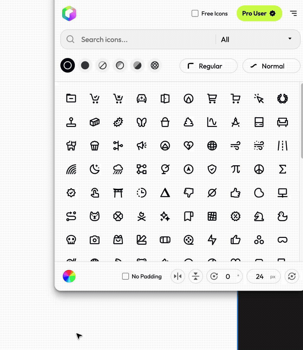
Remove Padding
Boxicons come with built-in padding to ensure consistent sizing and alignment. However, you can remove this padding directly in the Figma plugin if needed. Click on the “No Padding” option before inserting the icon. This will insert the icon without any extra space around it, allowing for tighter layouts.
Flip and Rotate
You can flip icons horizontally or vertically, as well as rotate them to any angle. Click on the flip or add a value to rotate in the plugin interface before inserting the icon. This allows you to adjust the orientation of the icon to fit your design.
Scale Icons
Input a custom size value betoween 16px and 512px to scale the icon directly from the plugin. This helps you quickly get the right size without needing to resize it manually after insertion.
You can reset the changes by clicking on the Reset icon on the right of the bottom toolbar.